

Mastering the CSS Box Model: A Comprehensive Guide for Web Developers


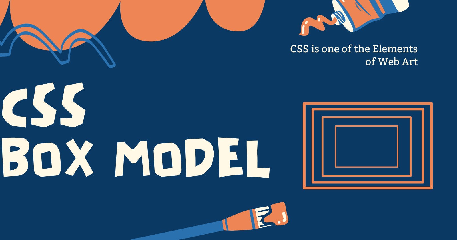
Table of contents
In the dynamic world of web development, understanding the CSS Box Model is akin to wielding a master key that unlocks the door to crafting stunning and responsive websites. Like the blueprint of a building, it forms the very foundation upon which the entire web layout is constructed. However, the CSS Box Model continues to be a mystery to many prospective developers because layers of padding, borders, and margins hide its complexity. Fear not, for we are about to set out on a quest to debunk the CSS Box Model in this thorough guide. We'll dissect its four fundamental layers—content, padding, border, and margin—and give you the knowledge and abilities you need to create eye-catching web interfaces with accuracy and grace.
What is the CSS Box Model?
The CSS Box Model is a conceptual framework that defines how elements are rendered on a web page. It visualizes elements as rectangular boxes, where each box consists of four essential layers: content, padding, border, and margin. These layers determine the space an element occupies, its relationship with neighboring elements, and how it responds to user interactions. In short, it is a way of thinking about how HTML elements are displayed on a webpage.

The Four Essential Layers
In this section, we will explore each layer of the CSS Box Model in detail:
Content Layer: The content layer is the innermost part of the rectangular box that represents an HTML element. It contains the actual content of the element, which can be text, images, videos, or other HTML elements. Understanding and controlling the content layer is crucial because it directly affects what users see on your web page.
The key aspects of this layer are :
Sizing Content:
You can control the dimensions of the content layer using CSS properties like
widthandheight.- -Content Overflow: Sometimes, the content within an element might be too large to fit within the dimensions you've specified. In such cases, you'll encounter content overflow. In this case, CSS provides properties like
overflowandtext-overflowto control how overflow is handled. For instance, you can setoverflow: hidden;to hide content that overflows the element's boundaries ortext-overflow: ellipsis;to truncate text with an ellipsis (...) when it overflows a container..container { width: 300px; /* Define a fixed width for the container */ border: 1px solid #ccc; overflow: hidden; /* Hide content that overflows the container */ text-overflow: ellipsis; /* Show ellipsis for overflow */ } /*In this example, if the content inside the .overflow-container exceeds 200 pixels in width, it will be truncated with an ellipsis at the end of the visible content, like this: "This is some text that overfl..."-- Box Sizing: The
box-sizingproperty controls how the total dimensions of an element are calculated. It can have two values:content-boxandborder-box. The default value iscontent-box, which means that thewidthandheightproperties only apply to the content layer. Any padding or borders you add will increase the overall size of the element. This can sometimes lead to unexpected layout issues. Theborder-boxvalue makes thewidthandheightproperties include the content, padding, and border within the specified dimensions. This can make sizing elements more intuitive, especially in responsive design..element { width: 200px; height: 100px; padding: 10px; border: 2px solid #000; box-sizing: content-box; } /*In this example, the total width of the .element will be 200px + 20px (padding) + 4px (border) = 224px.The content layer is where the primary content of an element resides. By setting its dimensions, handling content overflow, and understanding the
box-sizingproperty, you gain control over how the core content is displayed within the element's boundaries.Padding: Padding is the space between an element's content and its border. This property allows you to create space between the content of an HTML element and its border. It essentially adds an internal margin within the element, pushing its content away from the border. The
paddingproperty can be applied to any HTML element, and it can be set for individual sides (top, right, bottom, left) or all sides simultaneously using shorthand notation.Here's how you can use the
paddingproperty :You can set padding for all sides of an element simultaneously by specifying a single value. For example:
  .box {
    padding: 20px; /* 20 pixels of padding on all sides */
  }
--Setting Padding for Specific Sides:
You can set padding for specific sides of an element individually using properties like
padding-top,padding-right,padding-bottom, andpadding-left. For example:.box { padding-top: 10px; padding-right: 20px; padding-bottom: 10px; padding-left: 20px; }--Using Shorthand (The pro tip):
The
paddingproperty also supports shorthand notation for specifying padding for all sides in a single declaration. The values are specified in a clockwise order: top, right, bottom, left. For example:.box { padding: 10px 20px 10px 20px; /* top, right, bottom, left */ }Alternatively, if you specify just two values, they apply to the top and bottom (vertical) and right and left (horizontal) padding:
  .box {
    padding: 10px 20px; /* top/bottom: 10px, right/left: 20px */
  }
Padding is frequently used to establish spacing and enhance the aesthetics of web elements. The addition of breathing space around text, images, buttons, and other information within an element is extremely advantageous. Additionally, padding is essential to responsive design because it lets you change the distance between items to make sure they display properly across a variety of screens and devices.
Border: These are simply used to create lines or decorative boundaries around HTML elements. They are often used for styling, separating content, and creating appealing design elements like buttons and boxes.
Basic Border Properties:
--
Border-width: This property sets the width of the border. You can specify the width in pixels, ems, percentages, or other units. For example:.box { border-width: 2px; /* Sets a 2-pixel wide border */ }--
Border-style: This property defines the style of the border. Common values includesolid,dashed,dotted,double,groove,ridge, and more. For example:.box { border-style: solid; /* Sets a solid line border */ }--
border-color: This property specifies the color of the border. You can use color names, hexadecimal values, RGB values, or other color notations. For example:.box { border-color: #FF0000; /* Sets a red border color */ }Combining Border Properties :
You can combine these basic border properties into a single
borderproperty for convenience. Theborderproperty allows you to set the width, style, and color in one declaration. For example:.box { border-radius: 10px; /* Rounds all corners with a 10-pixel radius */ }You can also round specific corners by using
border-top-left-radius,border-top-right-radius,border-bottom-left-radius, andborder-bottom-right-radius.Border Shorthand :
For even more concise code, you can use the
bordershorthand property with values in this order:border-width,border-style, andborder-color. For example:.box { border: 2px dashed #008000; /* Sets a 2-pixel wide dashed green border */ } /*Borders can also be set differently on each side of an element using properties like border-top, border-right, border-bottom, and border-left. For example:*/ .box { border-top: 2px solid #FF0000; /* Sets a solid red border on the top side */ border-right: 1px dotted #008000; /* Sets a dotted green border on the right side */ }Nesting and Overlapping Borders:
When you nest HTML elements, their borders may overlap. You can control this behavior using the
border-collapseproperty for tables or thebox-shadowproperty to add a shadow around an element rather than using traditional borders.
Margin: Margins are used to control the space outside an HTML element's border. Margins create separation between elements, influencing the layout and spacing of content on a web page.
Properties :
--
margin-top,margin-right,margin-bottom, andmargin-left: These properties allow you to set margins for individual sides of an element. For example:.box { margin-top: 10px; /* Sets a top margin of 10 pixels */ margin-right: 20px; /* Sets a right margin of 20 pixels */ margin-bottom: 10px; /* Sets a bottom margin of 10 pixels */ margin-left: 20px; /* Sets a left margin of 20 pixels */ }--
margin: Themarginproperty allows you to set the margin for all sides simultaneously. You can specify one, two, three, or four values to control all or specific sides. For example:.box { margin: 10px; /* Adds 10 pixels of margin to all sides */ margin: 10px 20px; /* Adds 10 pixels of margin to top and bottom, 20 pixels to right and left */ margin: 10px 20px 15px; /* Adds 10 pixels of margin to top, 20 pixels to right and left, 15 pixels to bottom */ margin: 10px 20px 15px 5px; /* Adds 10 pixels of margin to top, 20 pixels to right, 15 pixels to bottom, 5 pixels to left */ }--Margin Collapse: One important concept to understand with margins is margin collapsing. Margin collapsing occurs when the margins of adjacent elements come into contact or overlap. In such cases, the larger of the two margins takes precedence, and the smaller margin is effectively "collapsed" or ignored.
For example, if you have two adjacent paragraphs with a margin-top and margin-bottom of 20px, the space between them will not be 40px; instead, the margin will collapse, and the space between them will be 20px. For Example :
   .box {
     width: 200px;
     height: 100px;
     border: 2px solid #333;
     margin: 10px;
   }
   .content {
     background-color: lightblue;
     margin: 20px;
   }
In this example, we have two
<div>elements: one with the class "box" and another nested inside it with the class "content." Both elements have margins applied.Margin collapse can be observed in this example between the "box" and "content" elements:
--The "box" element has a top margin of 10px.
--The "content" element within the "box" has a top margin of 20px.
You might expect that the total margin between the top of the "box" and the "content" would be the sum of these two margins, which is 30px. However, due to margin collapse, the larger of the two margins takes precedence, and the smaller margin is effectively collapsed.
In conclusion, the CSS Box Model is the cornerstone of web design, shaping how elements are structured and presented on the internet. This comprehensive guide has unraveled the intricacies of the Box Model, from its four essential layers—content, padding, border, and margin—to practical examples and best practices. Armed with this knowledge, you now possess the tools to create web layouts that are not just visually stunning but also responsive and organized.